INEOS Group.
Brand audit, strategy and a new identity for a Casablanca integrator of network, cloud and security: from a generic IT vendor to a group of specialists with one sign.
 ClientINEOS, Casablanca SectorNetwork, cloud & cybersecurity Year2024–2025 ScopeBrand audit, Brand strategy, Brand architecture, Visual identity, Guidelines
 01
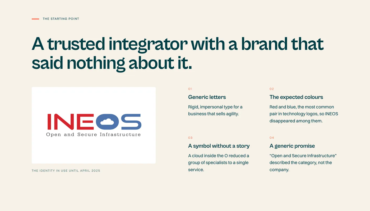
ChallengeINEOS designs, integrates and runs network, cloud and security infrastructure for companies across Morocco and West Africa. Its people were its edge, yet its brand said none of it: generic letters, the red and blue every technology company uses, a cloud drawn inside the O and a tagline any competitor could sign. As the business grew into specialist entities, it also needed an architecture that keeps them under one name.
- 01 · Challenge
- 02 · Approach
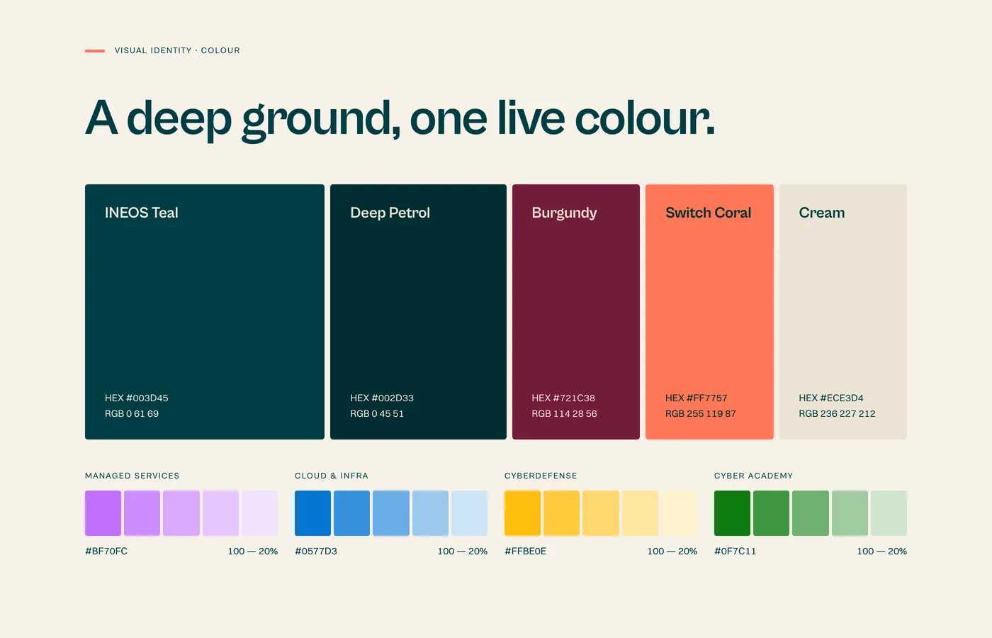
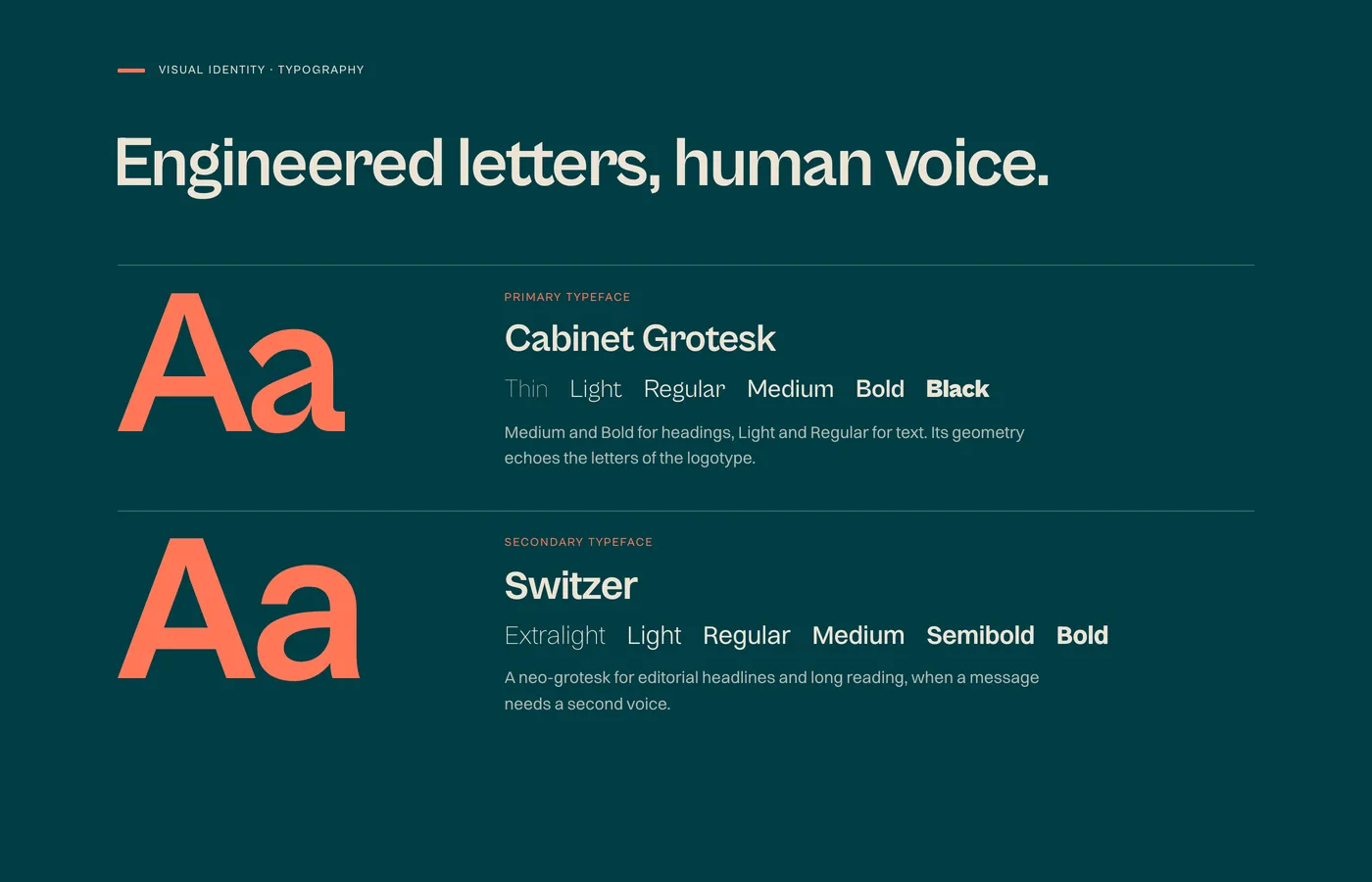
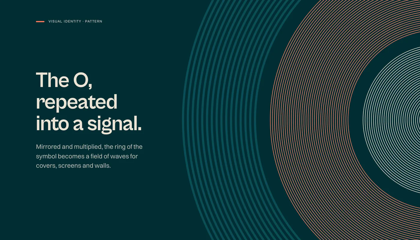
- 03 · The delivered system
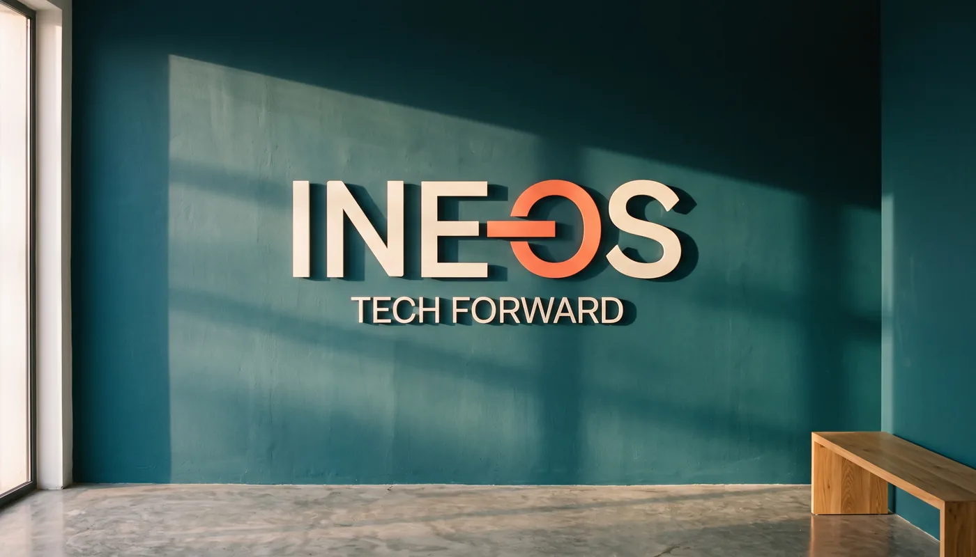
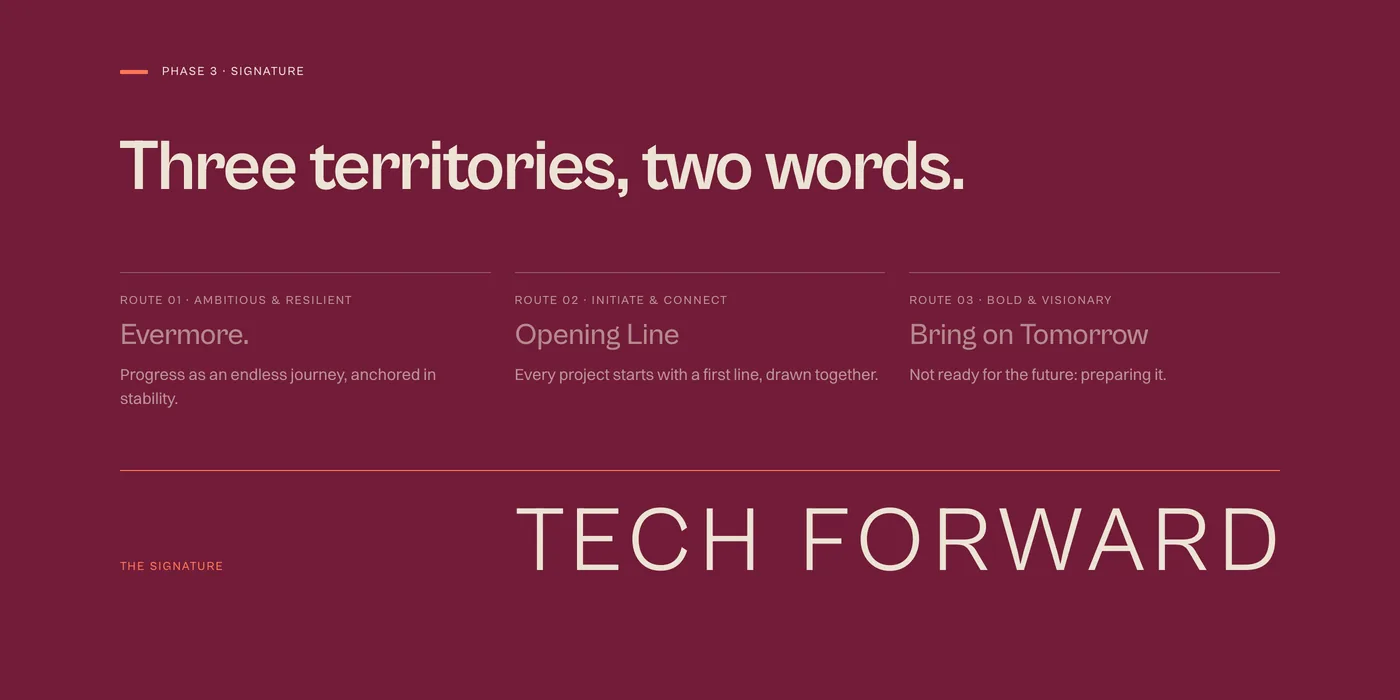
Tech Forward.
Turn a trusted integrator into a group with a vision, without losing the people who made it trusted.
01Positioning
From trust and security, where every integrator stands, to an inspiring vision with ambition, kept human.
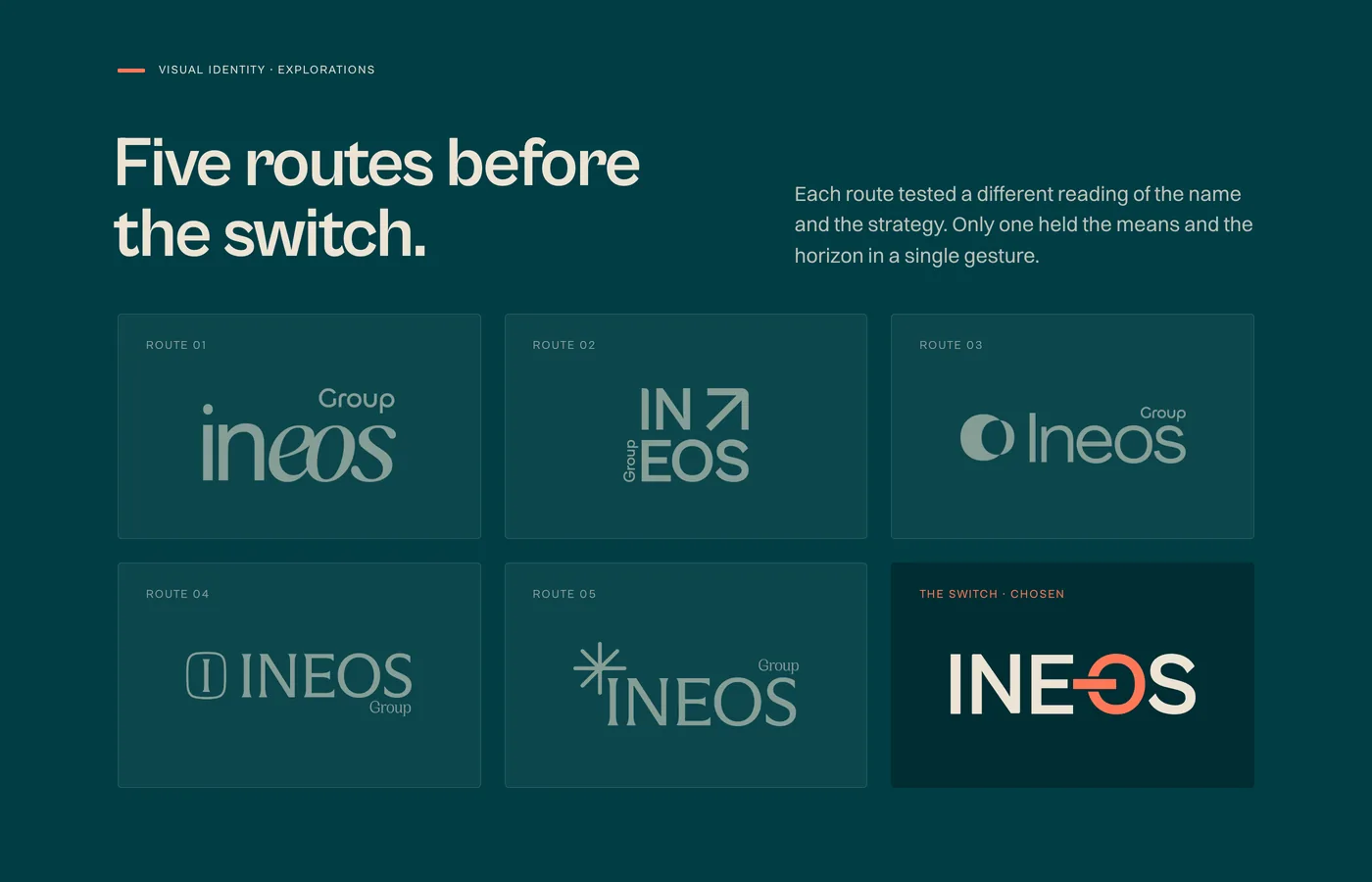
02Creative decision
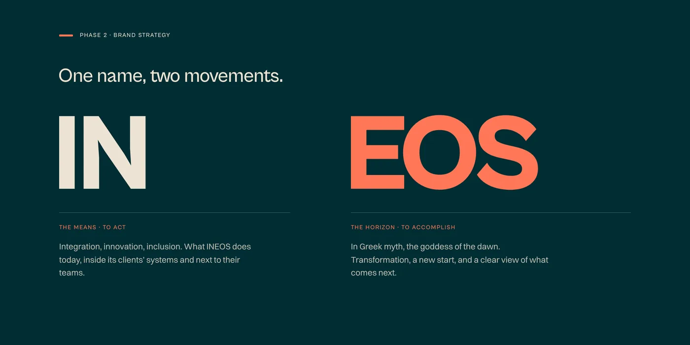
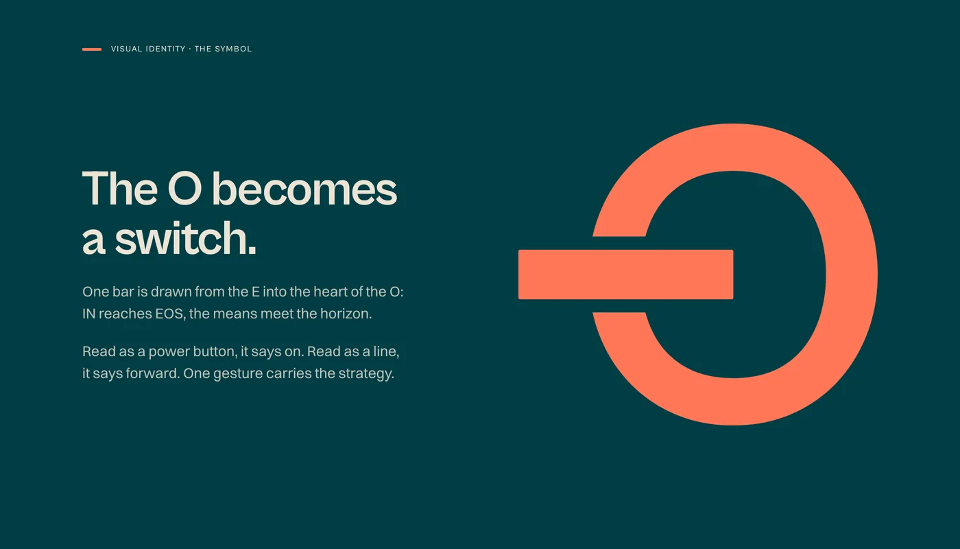
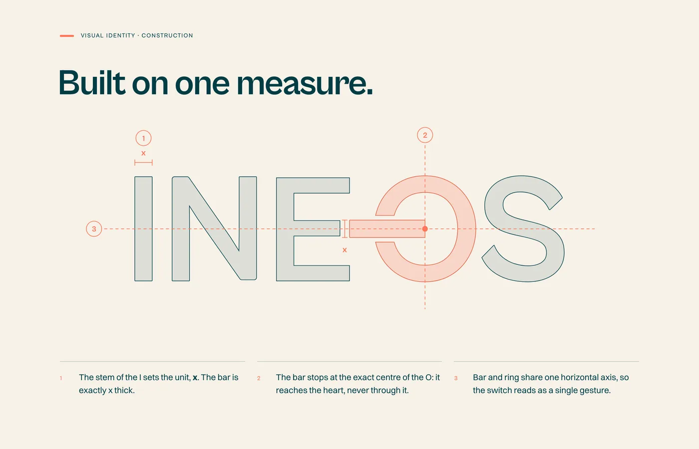
The O becomes a switch: a bar drawn from the E to the centre of the O, IN reaching EOS.
03System
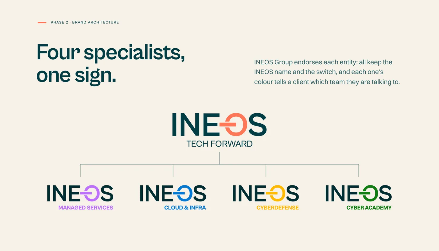
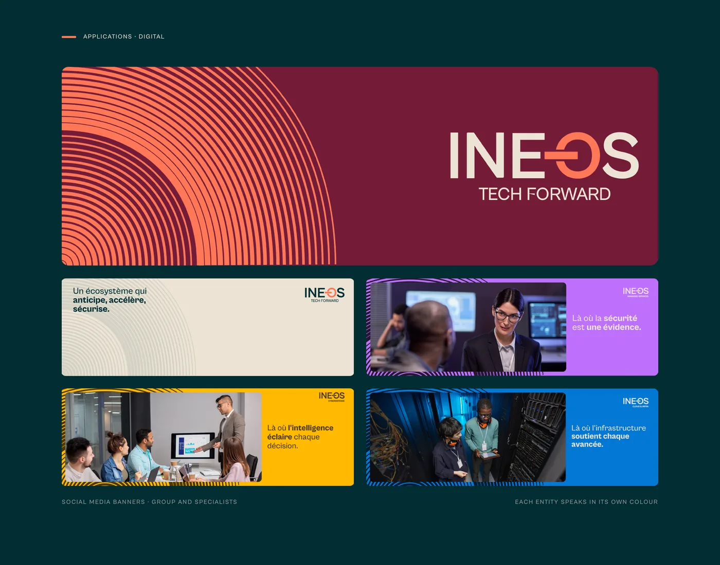
An endorsed architecture: four specialists keep the INEOS name and the switch, each in its own colour.
Brand motionThe identity in motion.
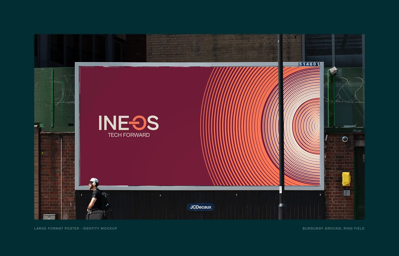
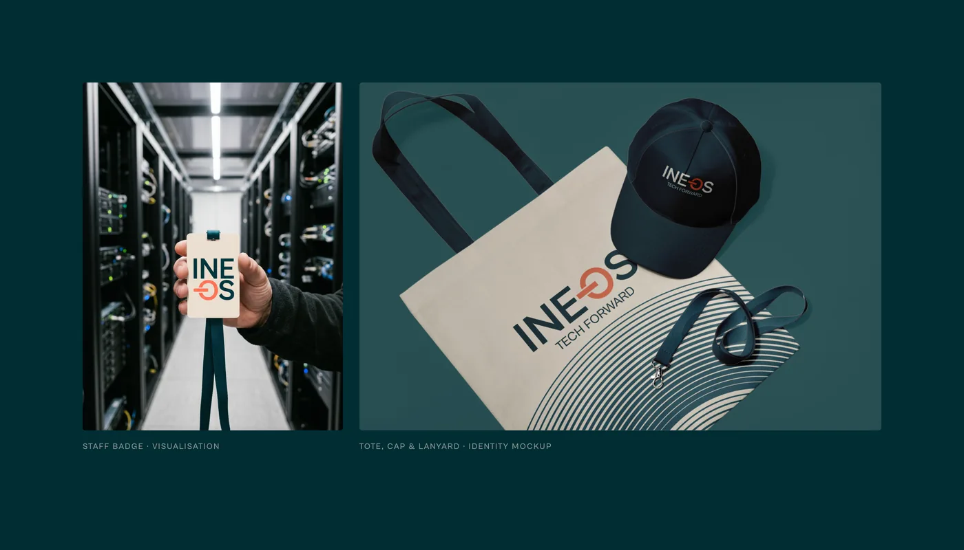
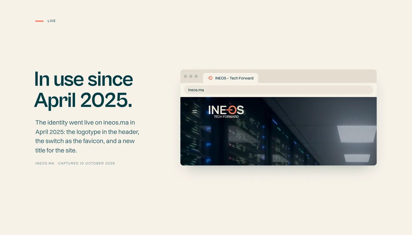
Brand applications.
Environment scenes are visualisations and mockups illustrate the brand system. The logotype, palette and typography are the client’s production files.

 Next projectUnivers Aquatique.View Available for new projects
Ready for your next stage?
Launching an offer, entering a market or updating your brand? Tell us what is changing. We’ll discuss the scope and the right place to start.
Book a 15-min call