Univers Aquatique.
Brand strategy, identity, guidelines and website for Morocco’s home of European aquarium brands: from a pet-shop sign to an aquarium house, with a fish drawn from water.
 ClientUnivers Aquatique, Rabat SectorAquariums & aquascaping Year2023–2024 ScopeBrand strategy, Visual identity, Brand guidelines, Website design
 01
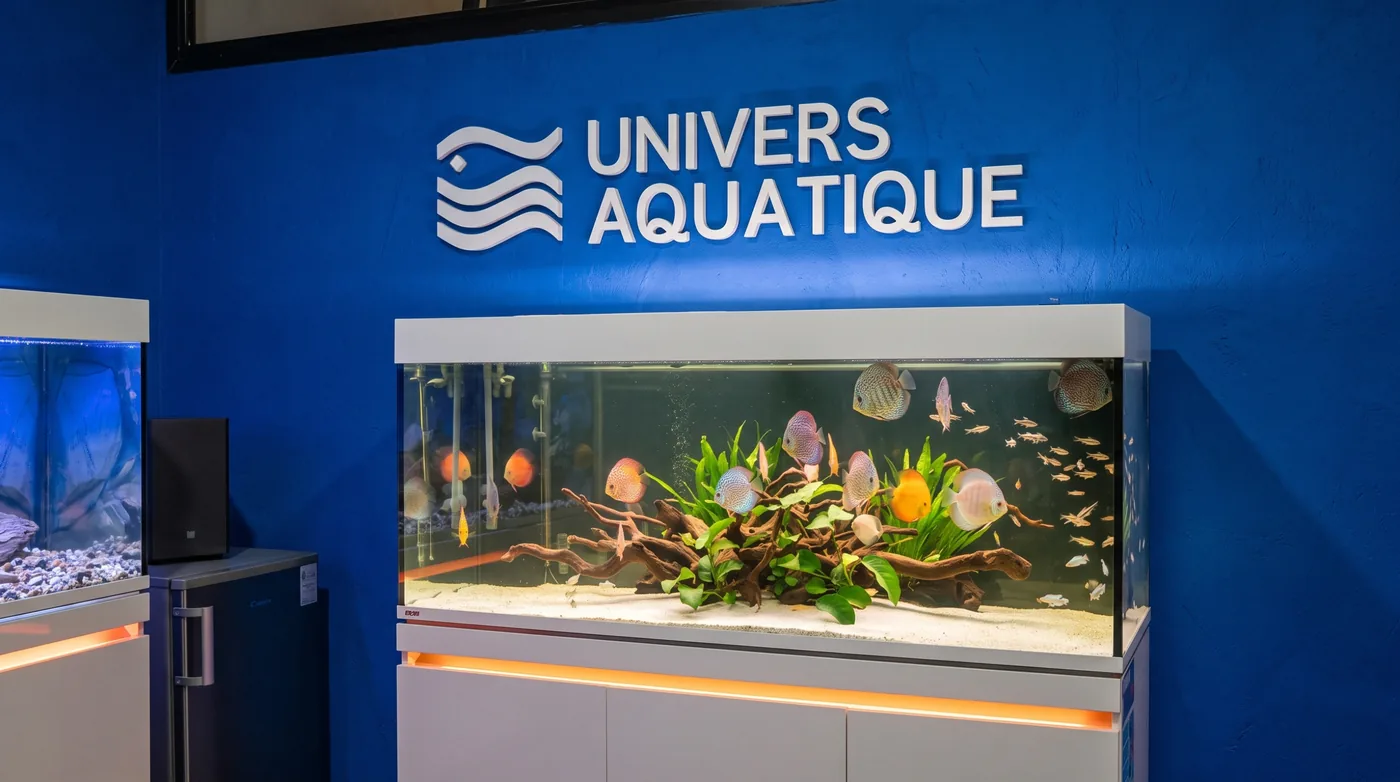
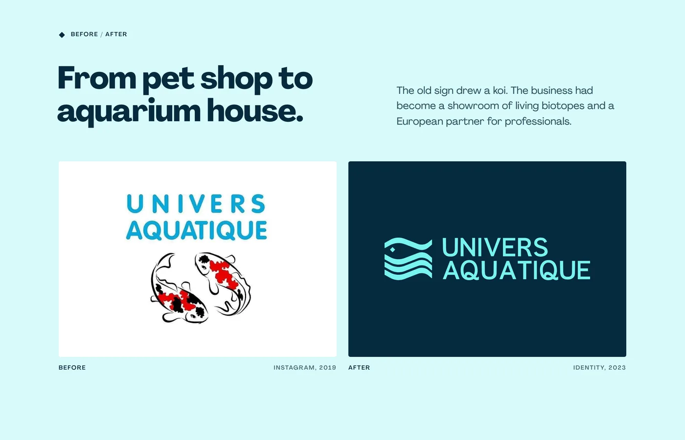
ChallengeUnivers Aquatique represents EHEIM, sera, SICCE, TUNZE and TECO in Morocco, from a two-level showroom in Rabat where Amazonian, Asian and African biotopes live side by side. Its image still belonged to a pet shop: a koi drawing under a light blue word. The ambition had moved on, to turnkey, self-purifying aquariums for homes, offices and the liberal professions, chosen like a piece of furniture rather than a piece of equipment.
- 01 · Challenge
- 02 · Approach
- 03 · The delivered system
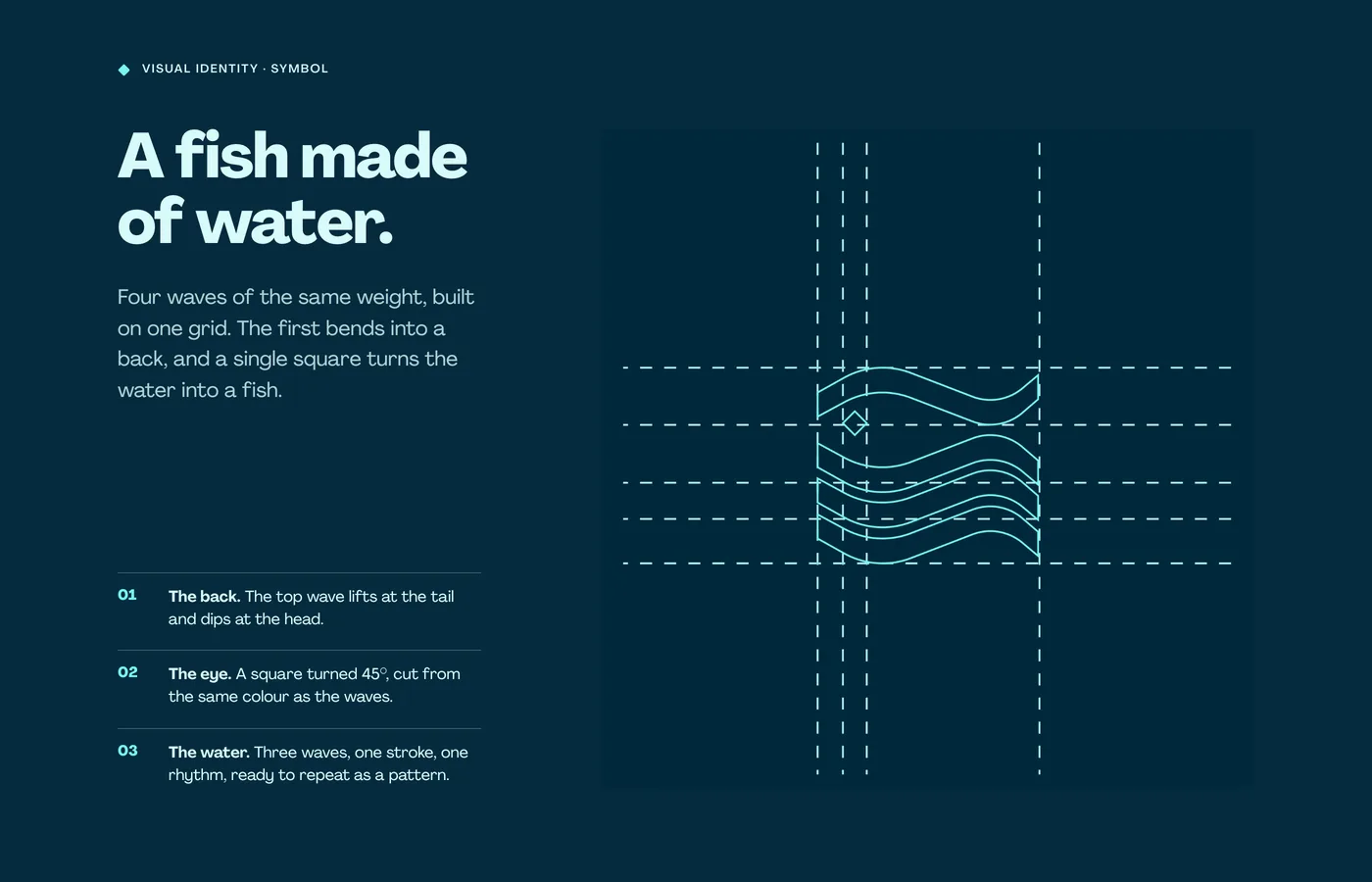
A fish made of water.
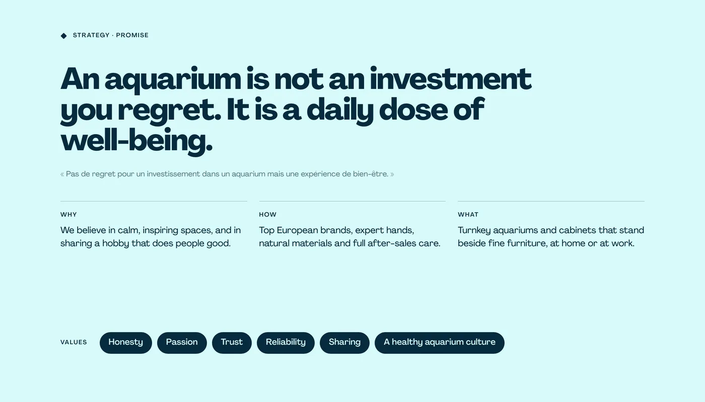
Turn a respected importer of aquarium brands into a house people visit for the calm, not only for the equipment.
01Positioning
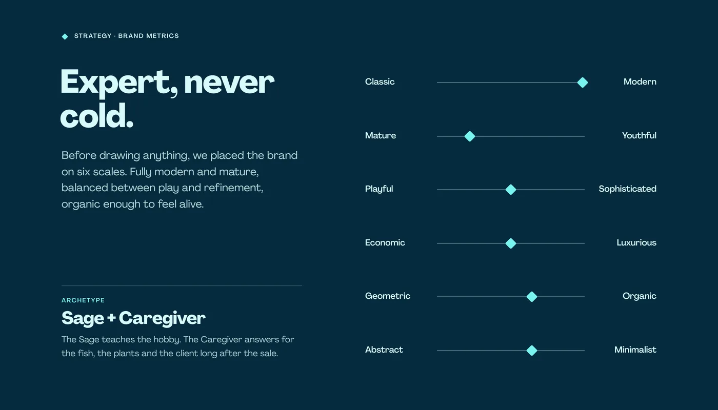
From equipment seller to aquarium house: turnkey biotopes that stand beside fine furniture, with care for the long run.
02Creative decision
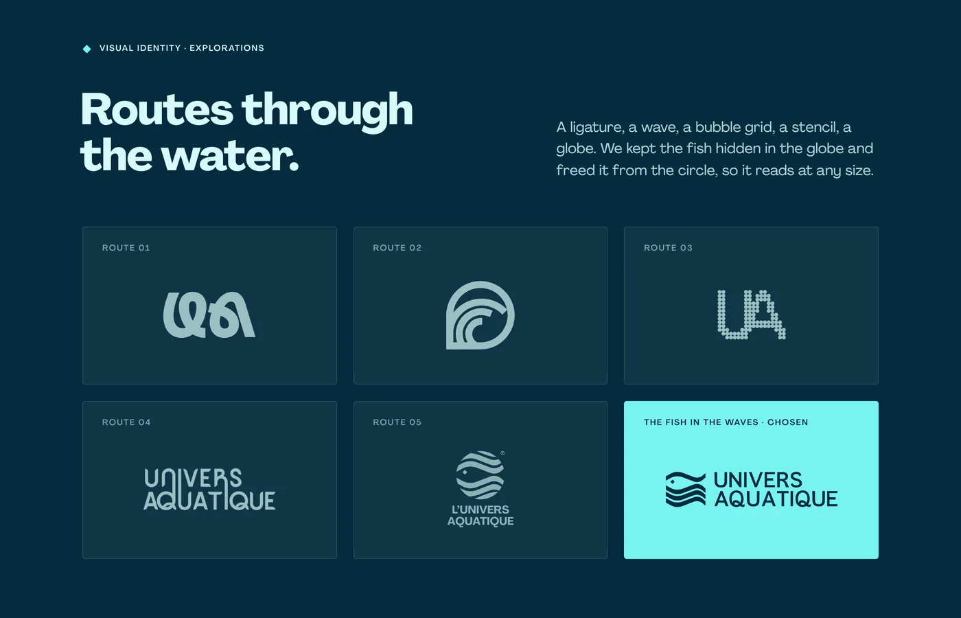
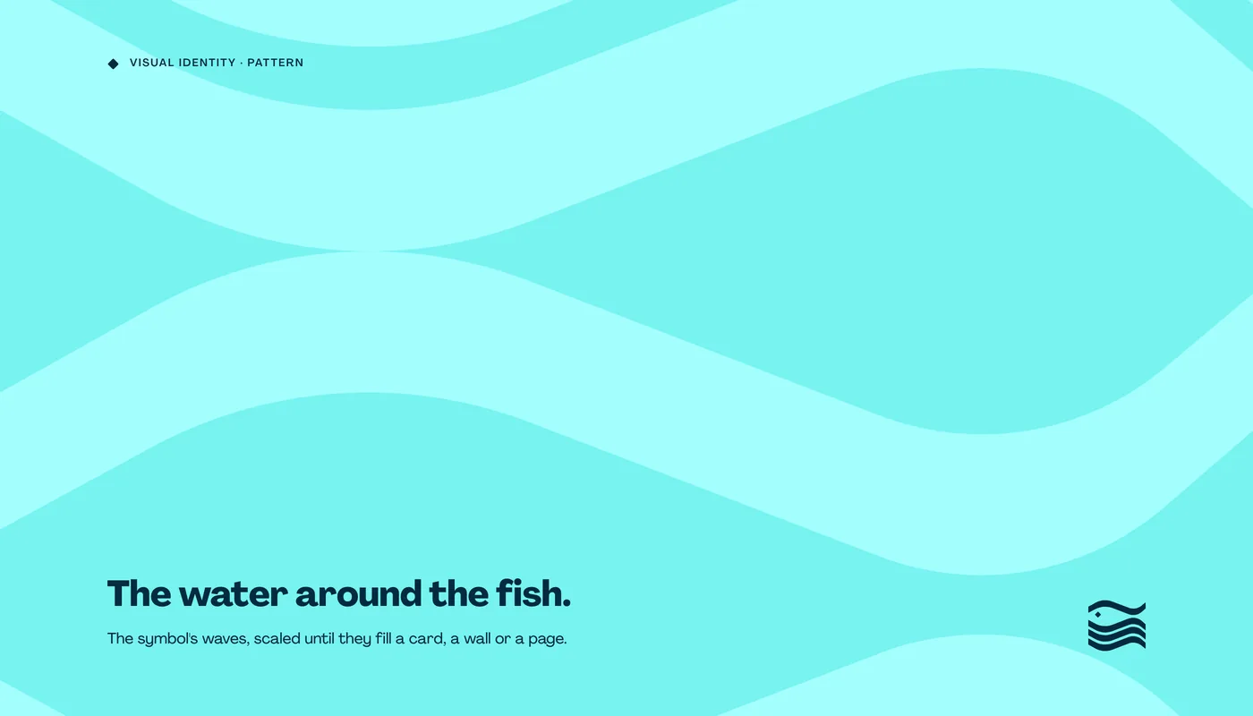
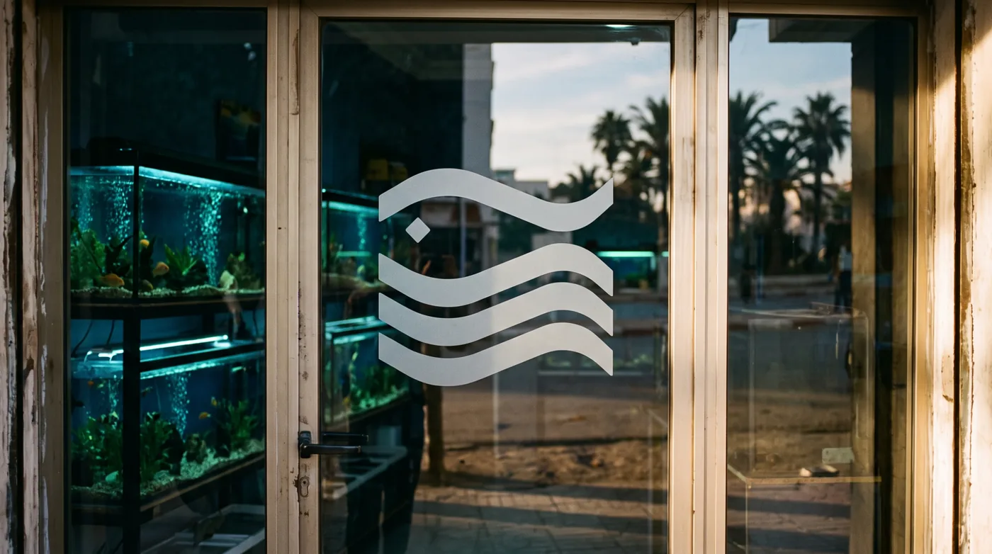
Four waves of one weight, built on one grid. The first bends into a fish’s back and a single square becomes its eye.
03System
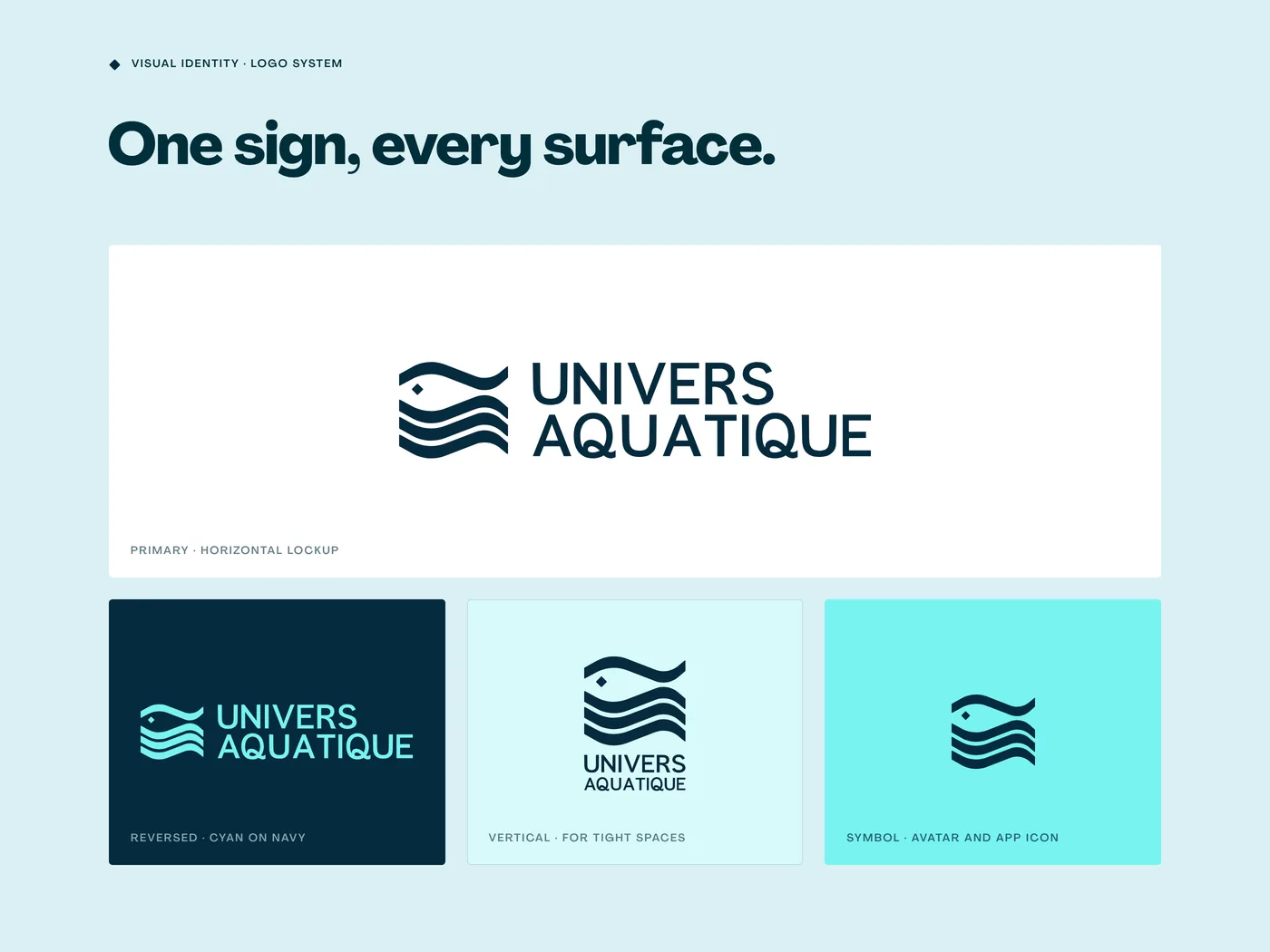
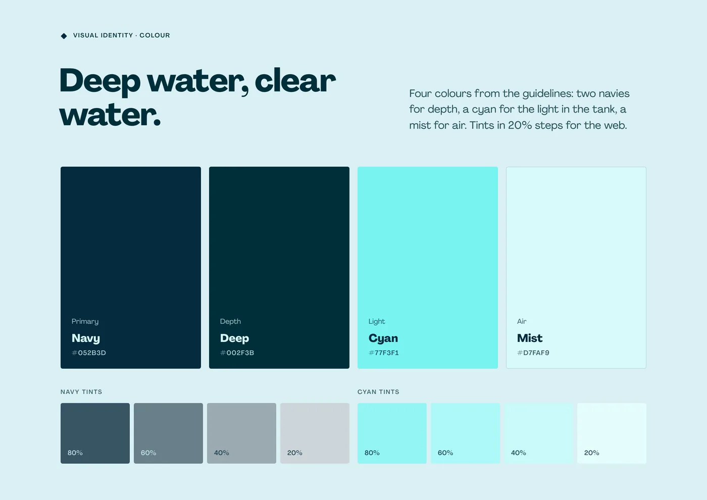
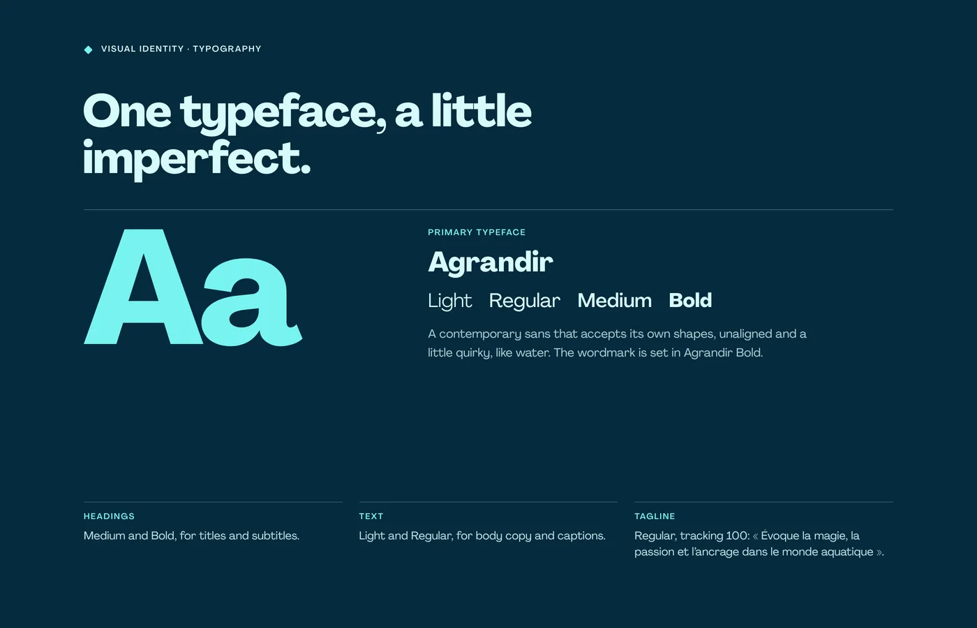
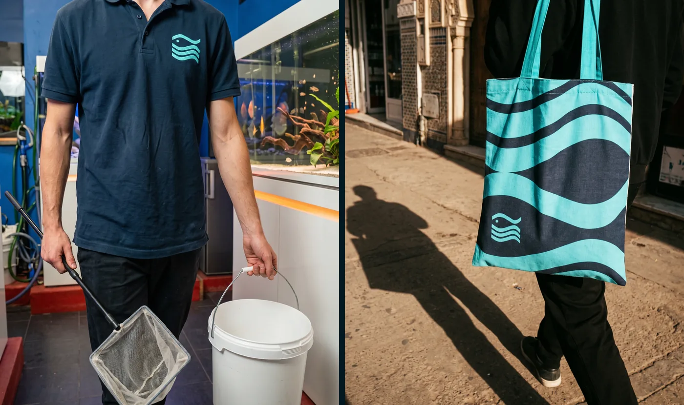
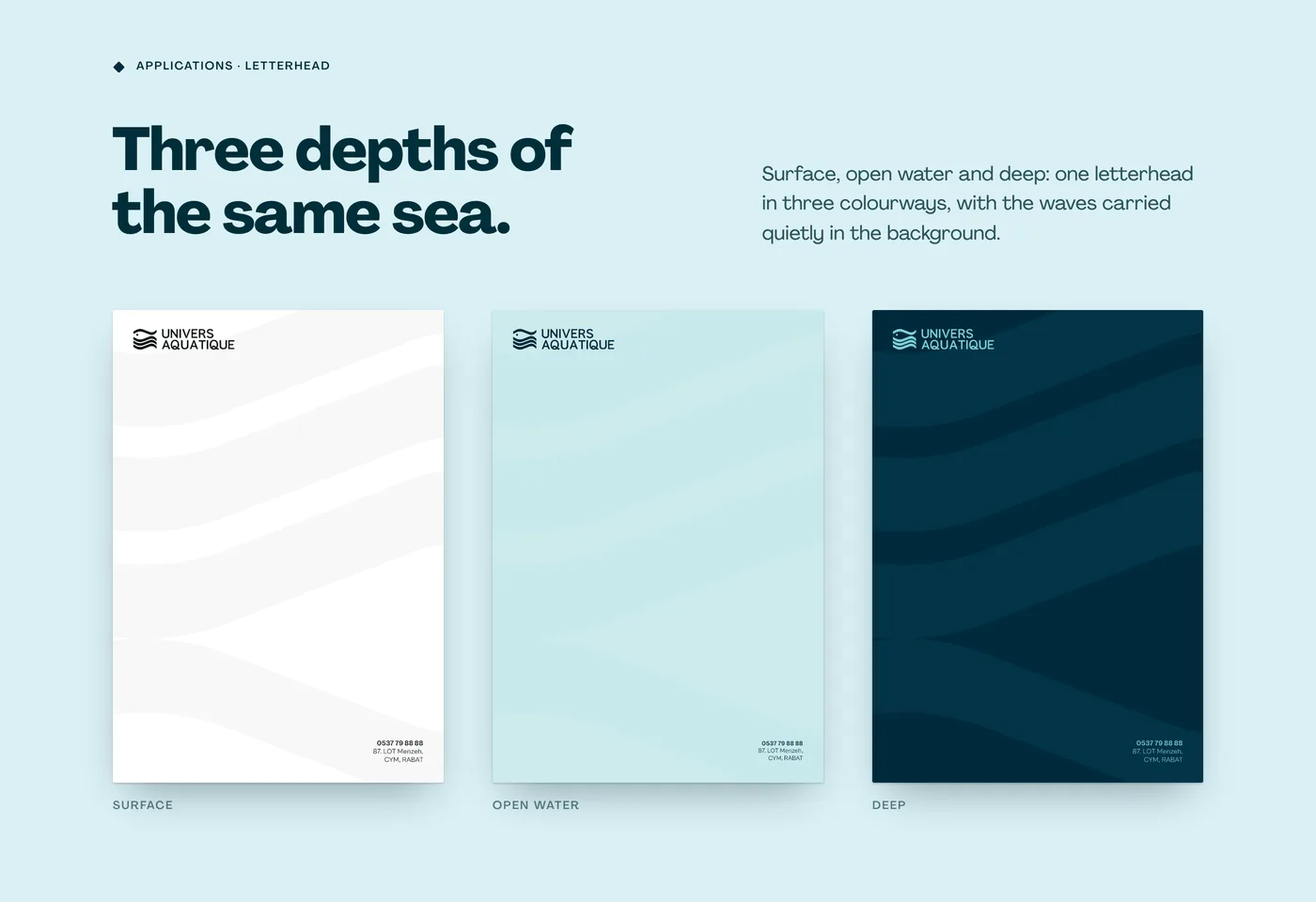
Two navies, a cyan and a mist, one typeface, Agrandir, and the waves scaled up into a pattern from cards to caps.
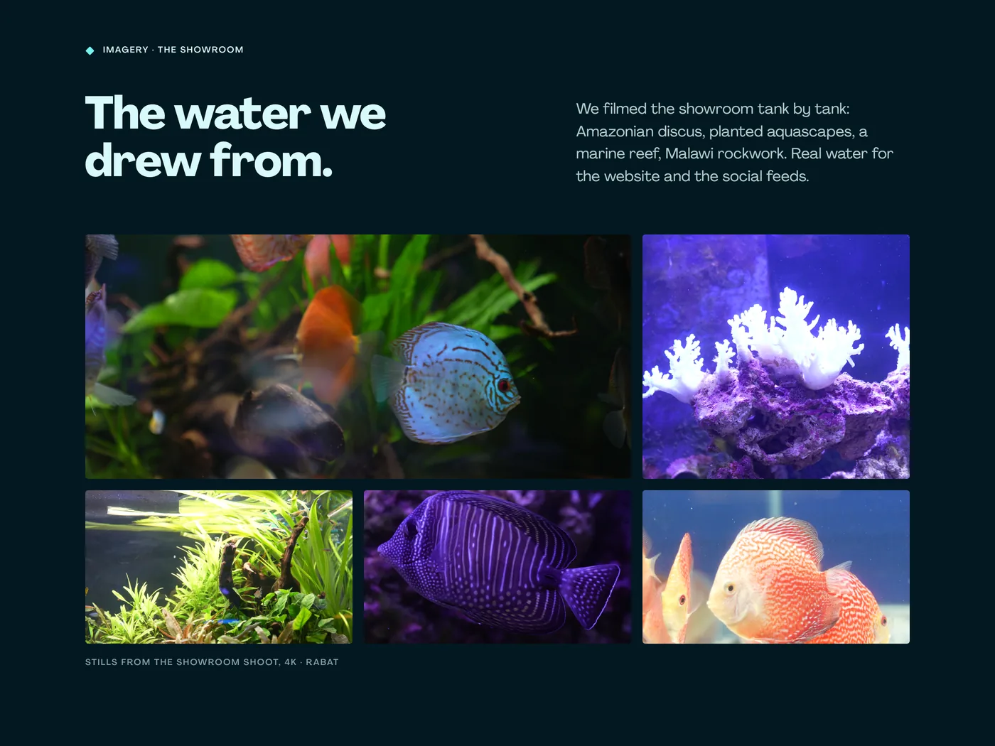
Film & motionFilmed tank by tank.
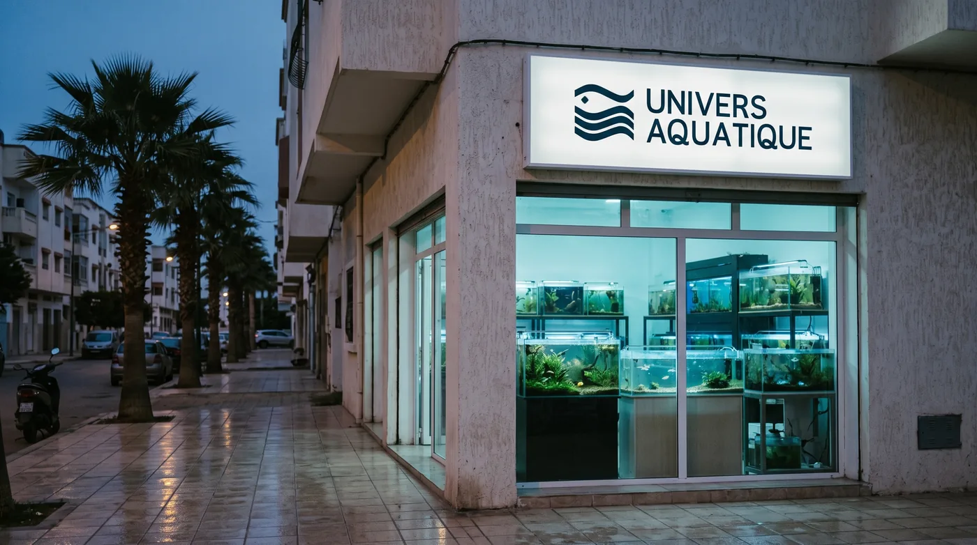
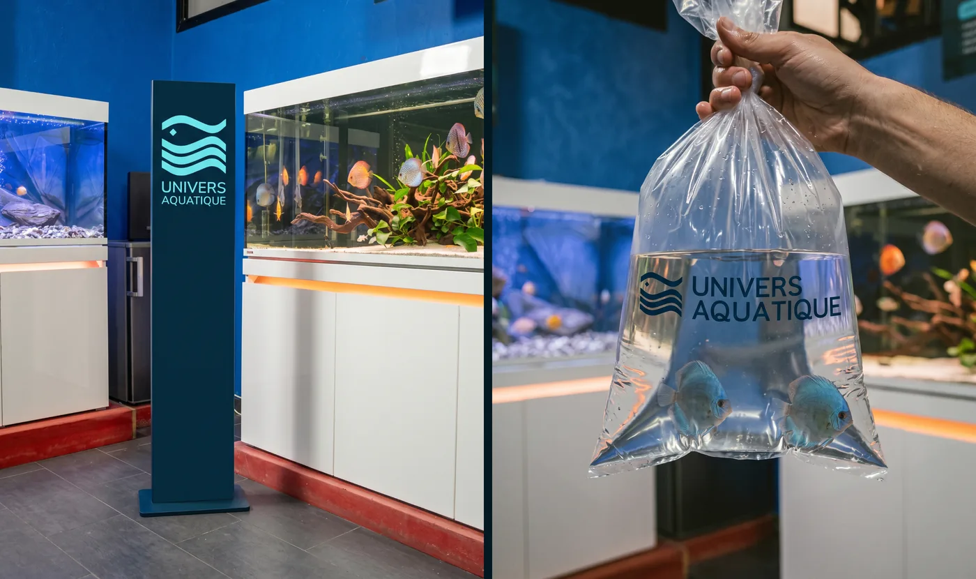
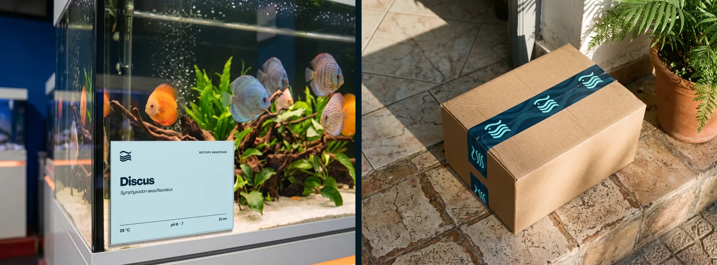
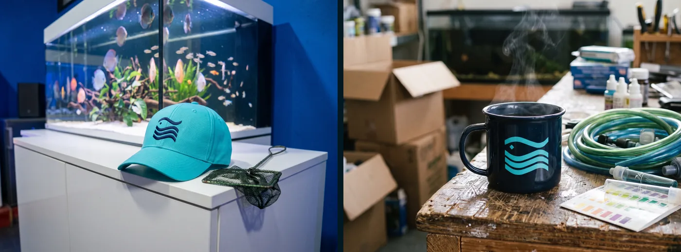
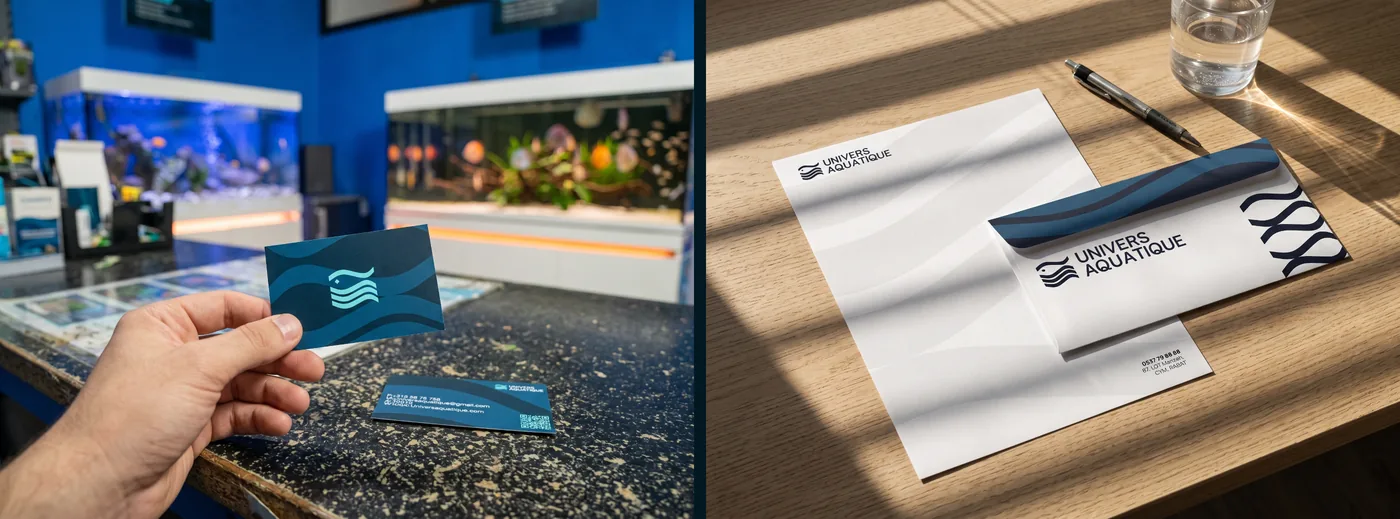
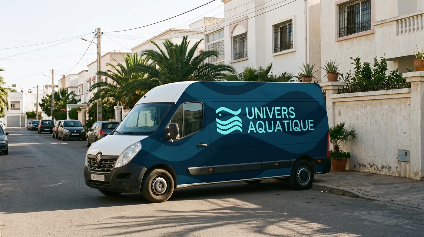
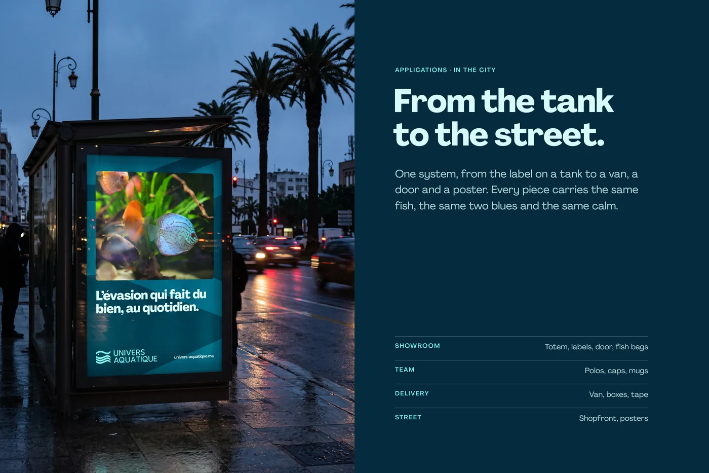
Brand applications.
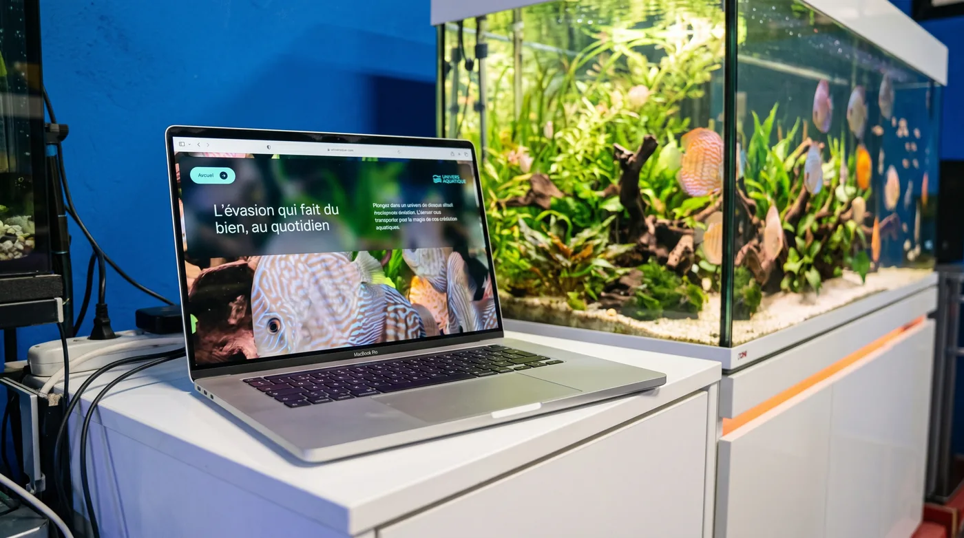
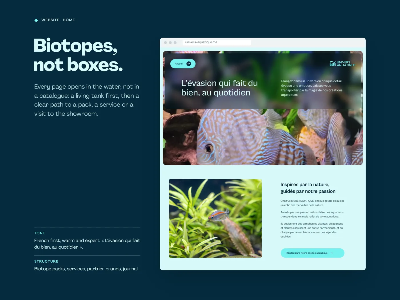
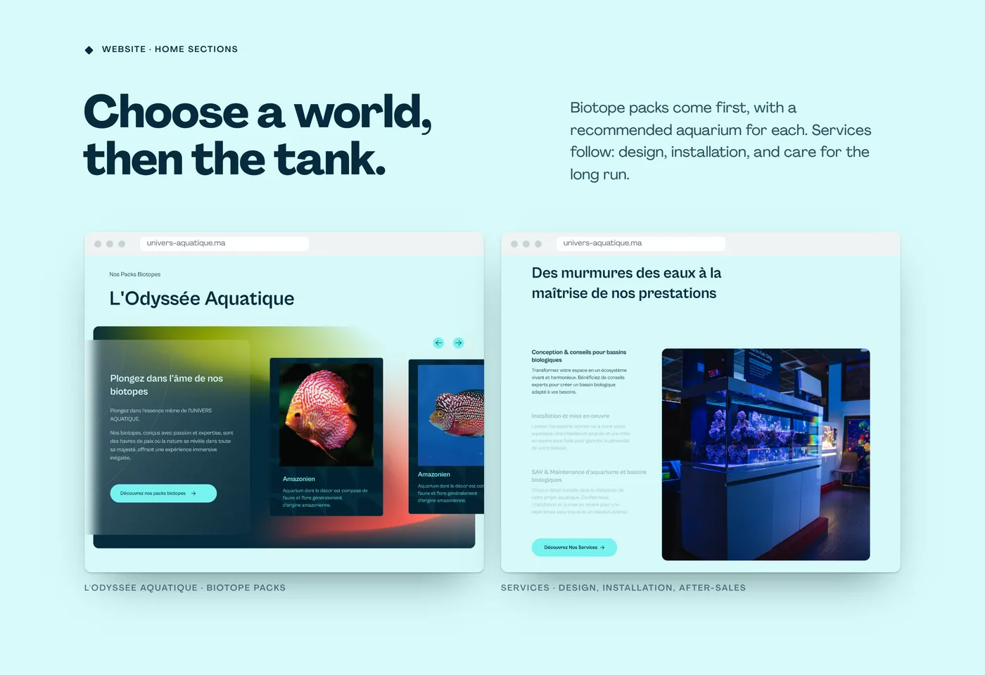
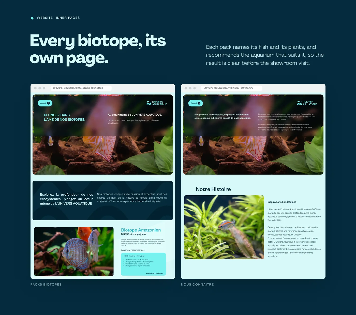
Application scenes are visualisations and the website is shown as designed. Logo, palette, type and artwork come from the brand guidelines; the showroom stills and film come from the 2023 shoot.
 Next projectSUPRABOX.View Available for new projects
Ready for your next stage?
Launching an offer, entering a market or updating your brand? Tell us what is changing. We’ll discuss the scope and the right place to start.
Book a 15-min call